CLIENT: SANTA PLANTA
PACKING
Challenge:
Develop a logo and visual communication for the debut line of the Santa Planta brand and its first plant-based food packaging, generating aligned and engaged communication with consumers.
The main objective of the project is to present its new products to the company's old consumers and, with this line, also conquer a new public to come into contact with plant-based foods.
Strategy & Creation:
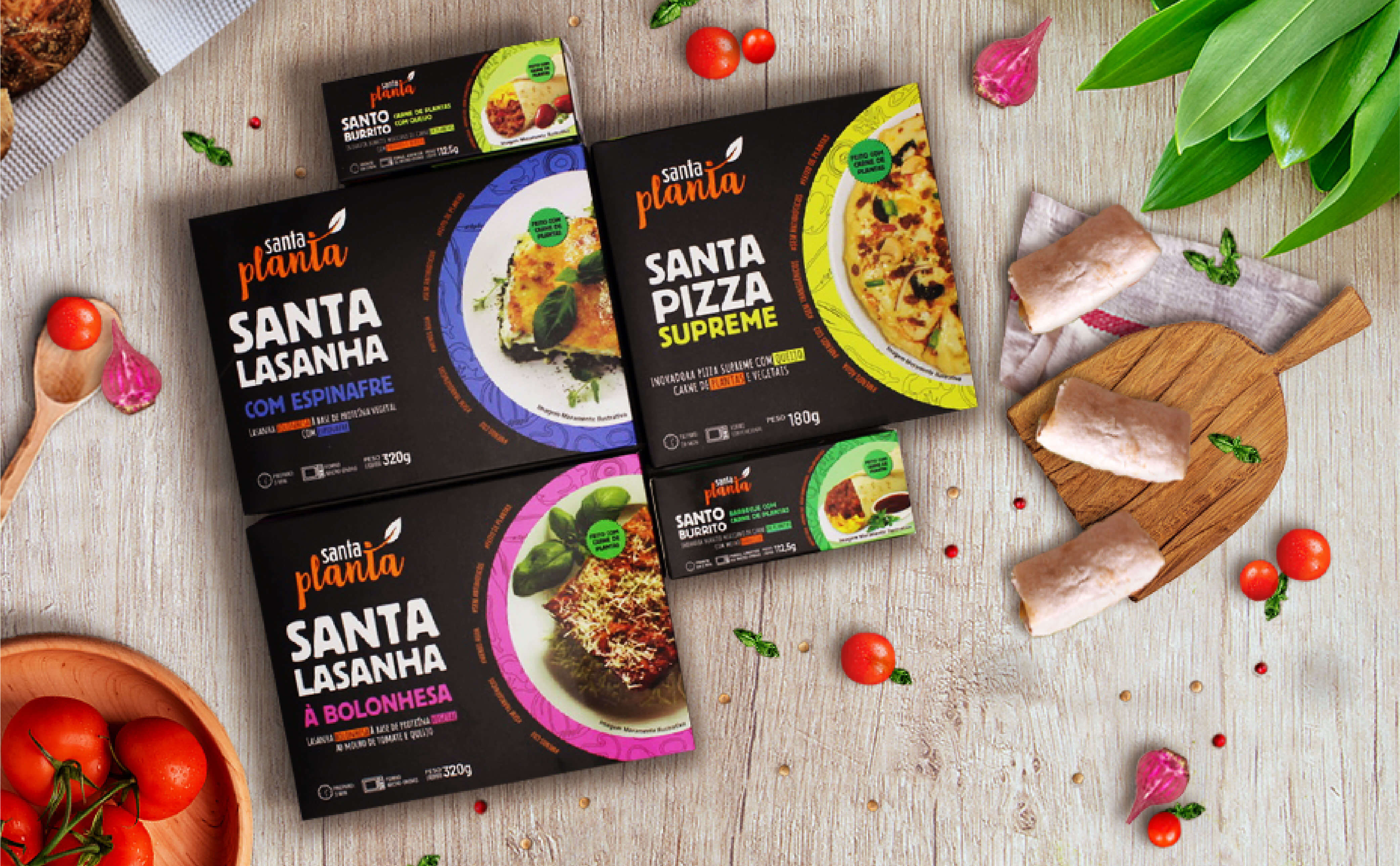
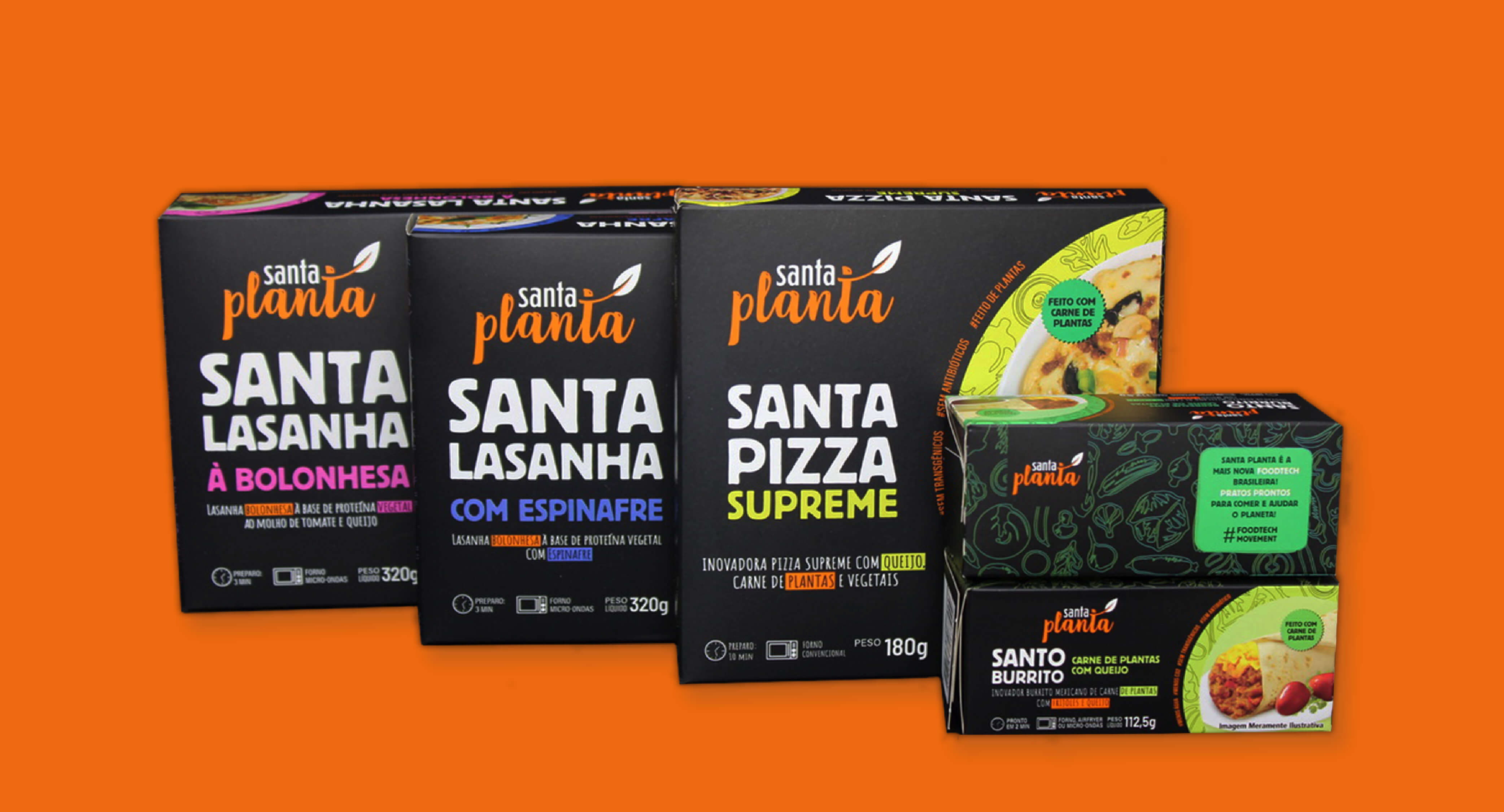
To create a coherent language with the purpose of the project, we developed the Santa Planta logo and the identity of its packaging line, exploring all the points that the brand wants to convey.
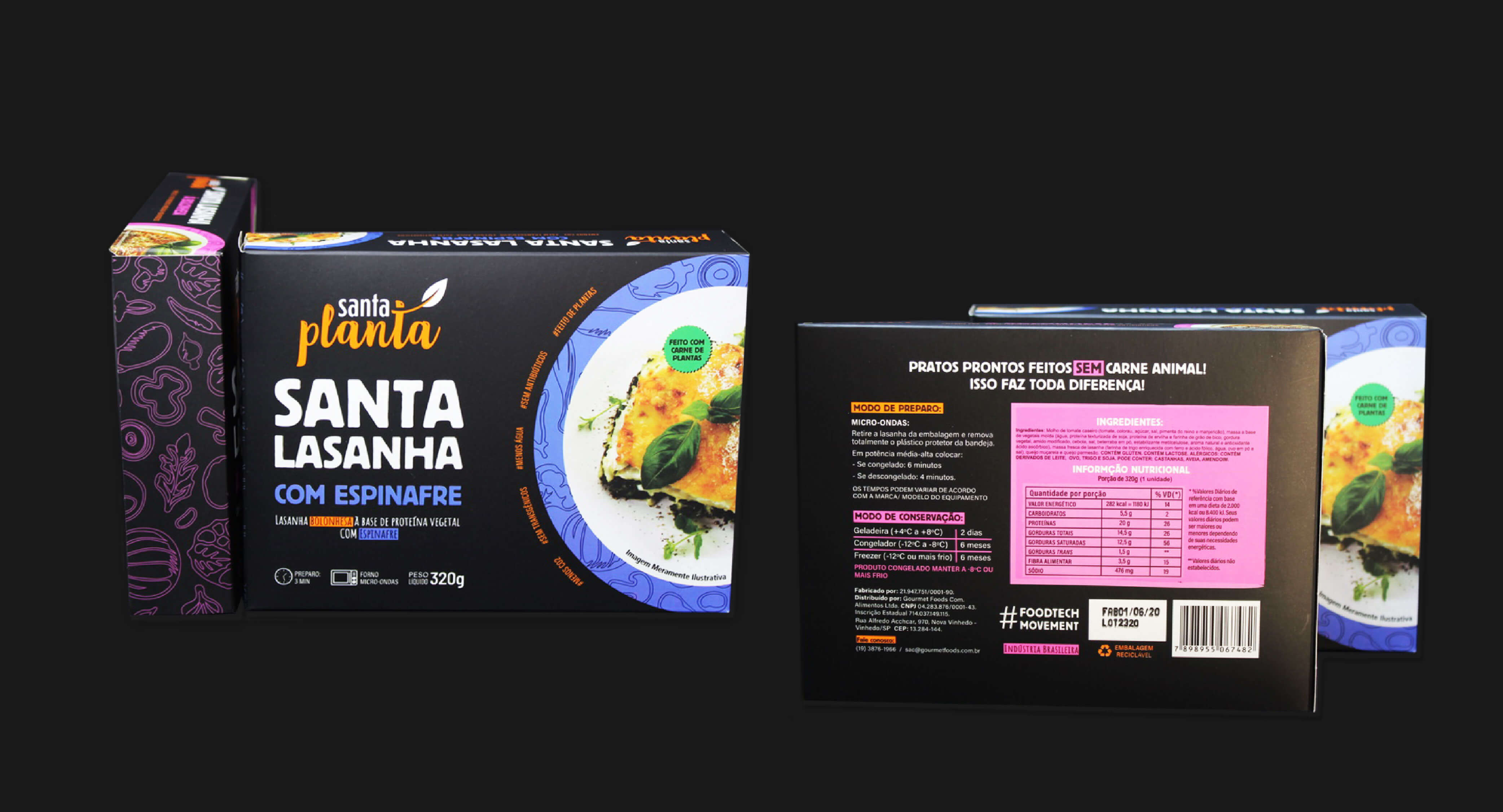
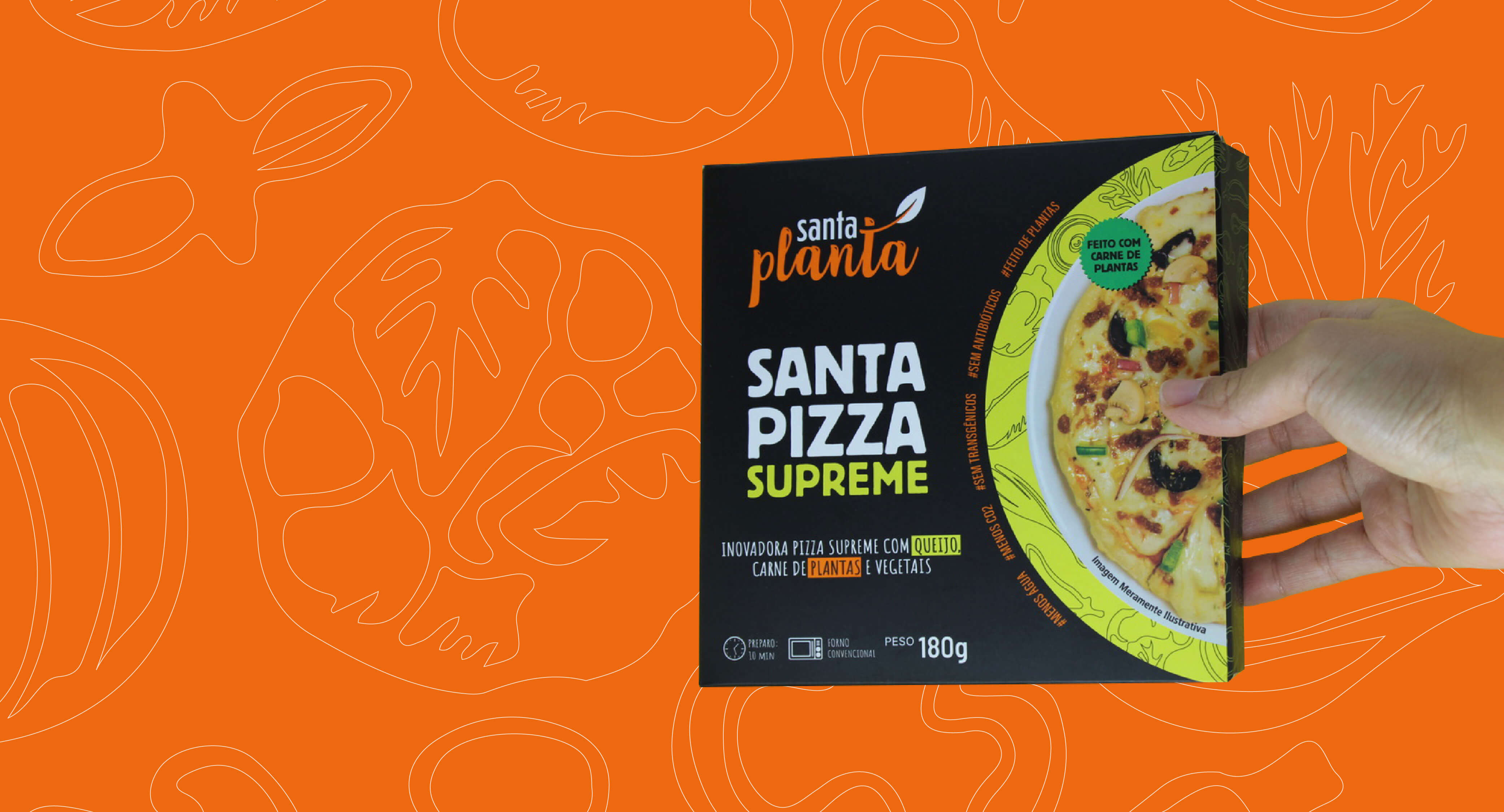
By incorporating different visual languages, such as mixing personalized illustrations and food photographs, we build a better understanding and consumer perception of the brand's values and proposal, which aims at healthy and conscious eating.
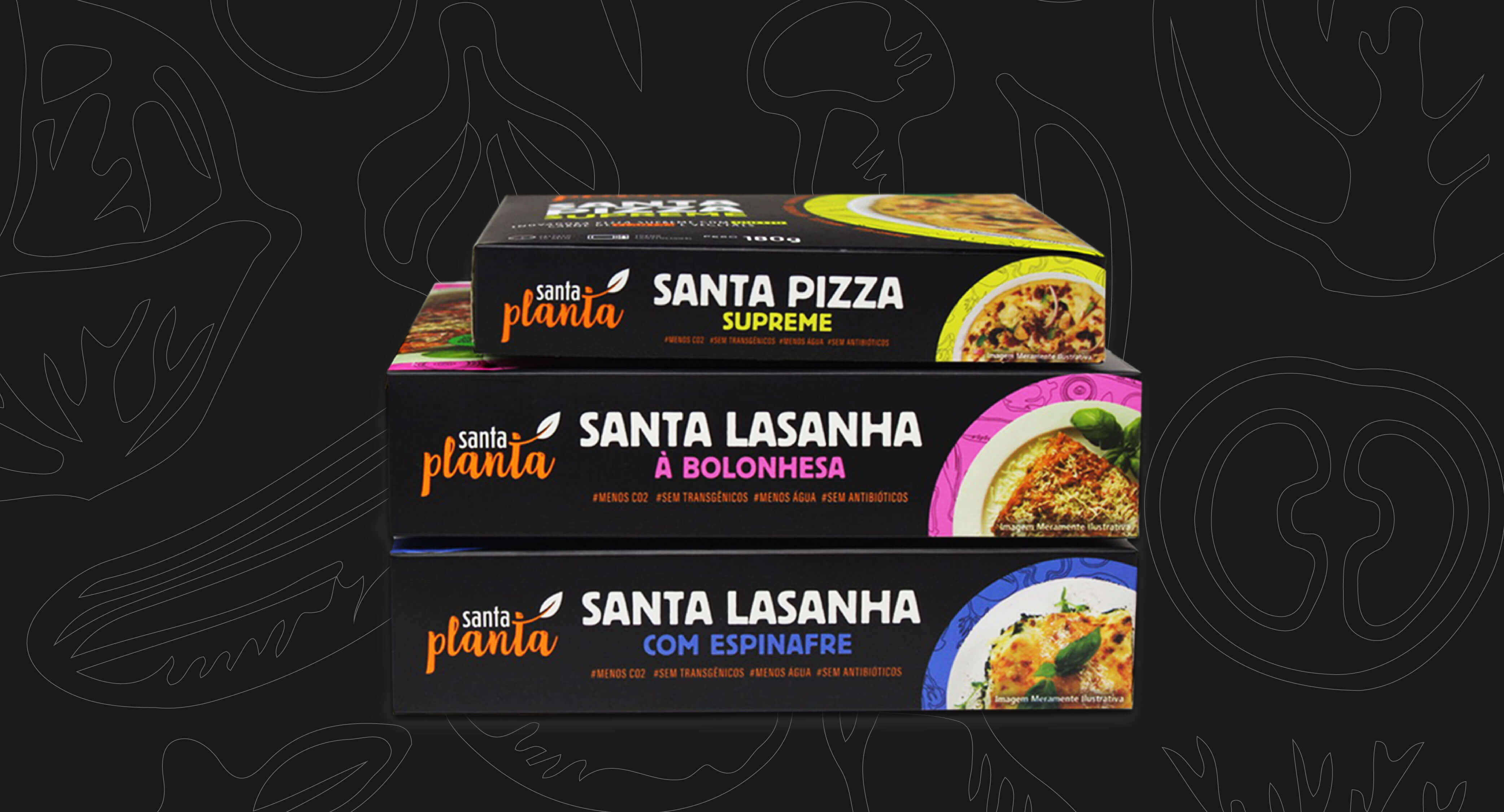
The great differential perceived in the frozen food sector and on supermarket shelves is the highlight of its design, as it is a package that bets on a black background, mixed with bright and colorful colors, such as yellow, green, blue and pink. In this way, the consumer is able to distinguish flavors and identify which product to take, in addition to creating a strong visual composition at the point of sale.
Result:
The result of the project was the creation of a strong, unique and competitive brand in the market. Evidenced by the colors and information, the packages are attractive and easy to identify for the consumer to quickly recognize the brand and type of product.