CLIENT: ORQUÍDEA ALIMENTOS
PACKING
Challenge:
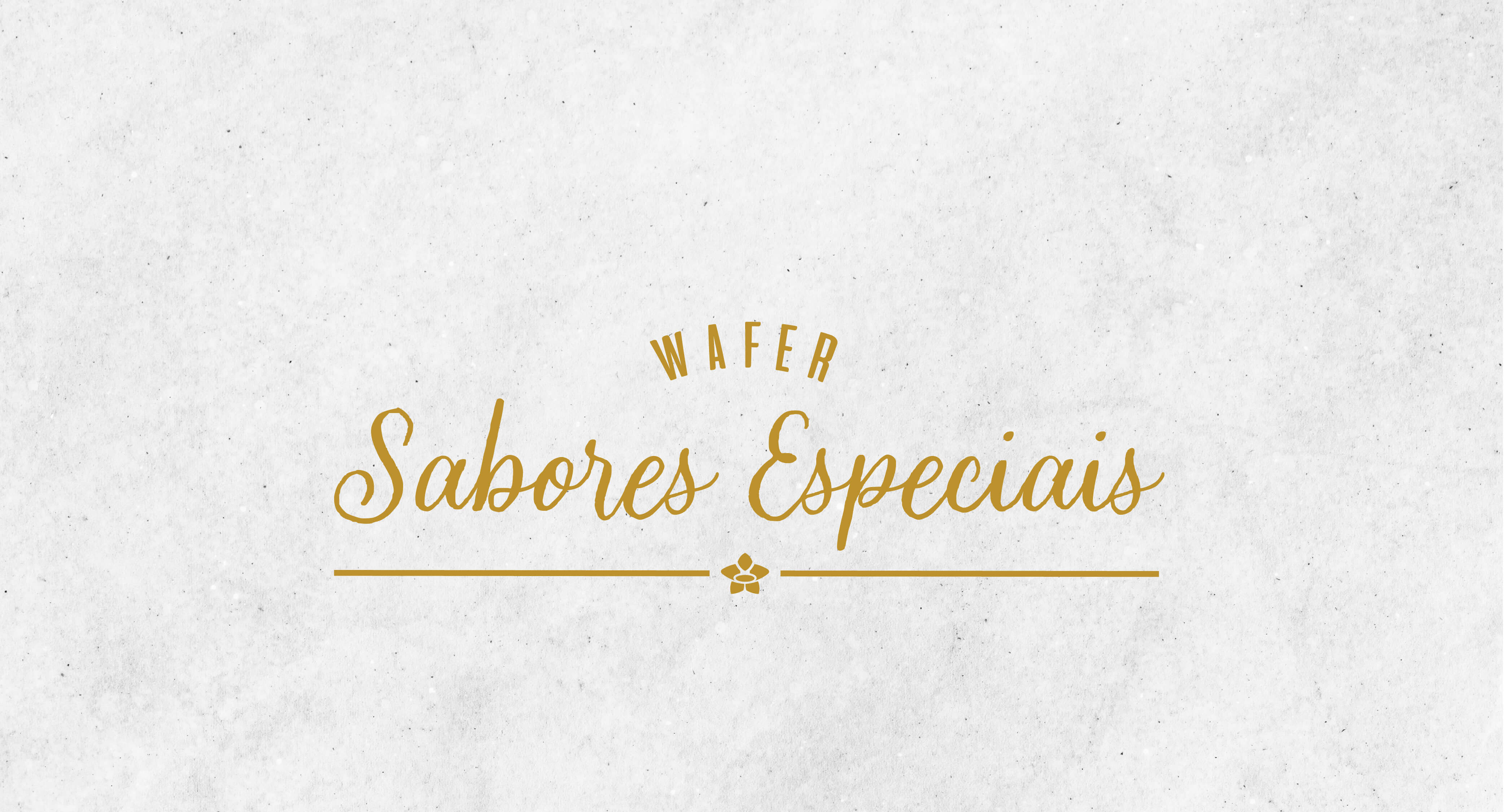
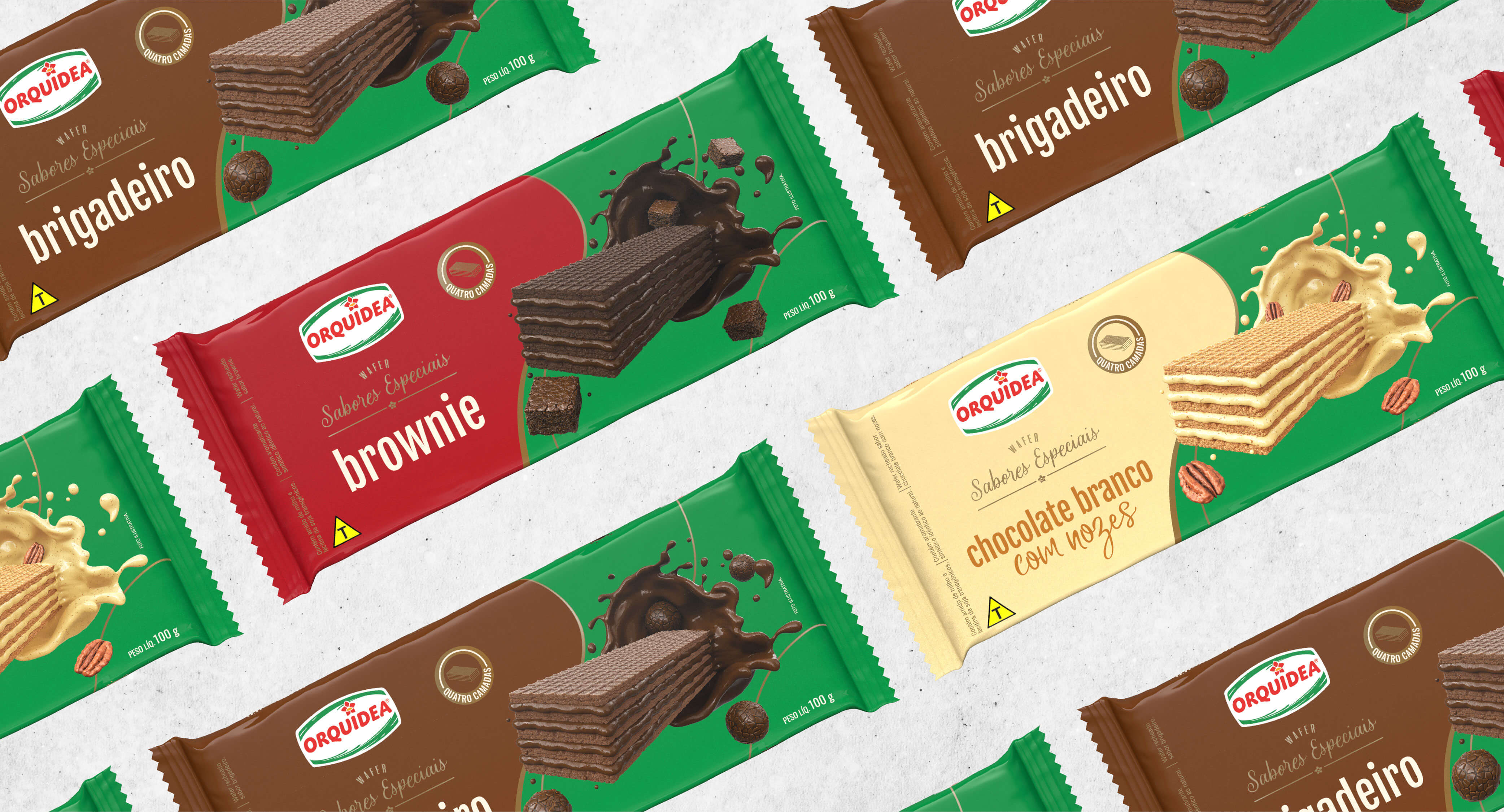
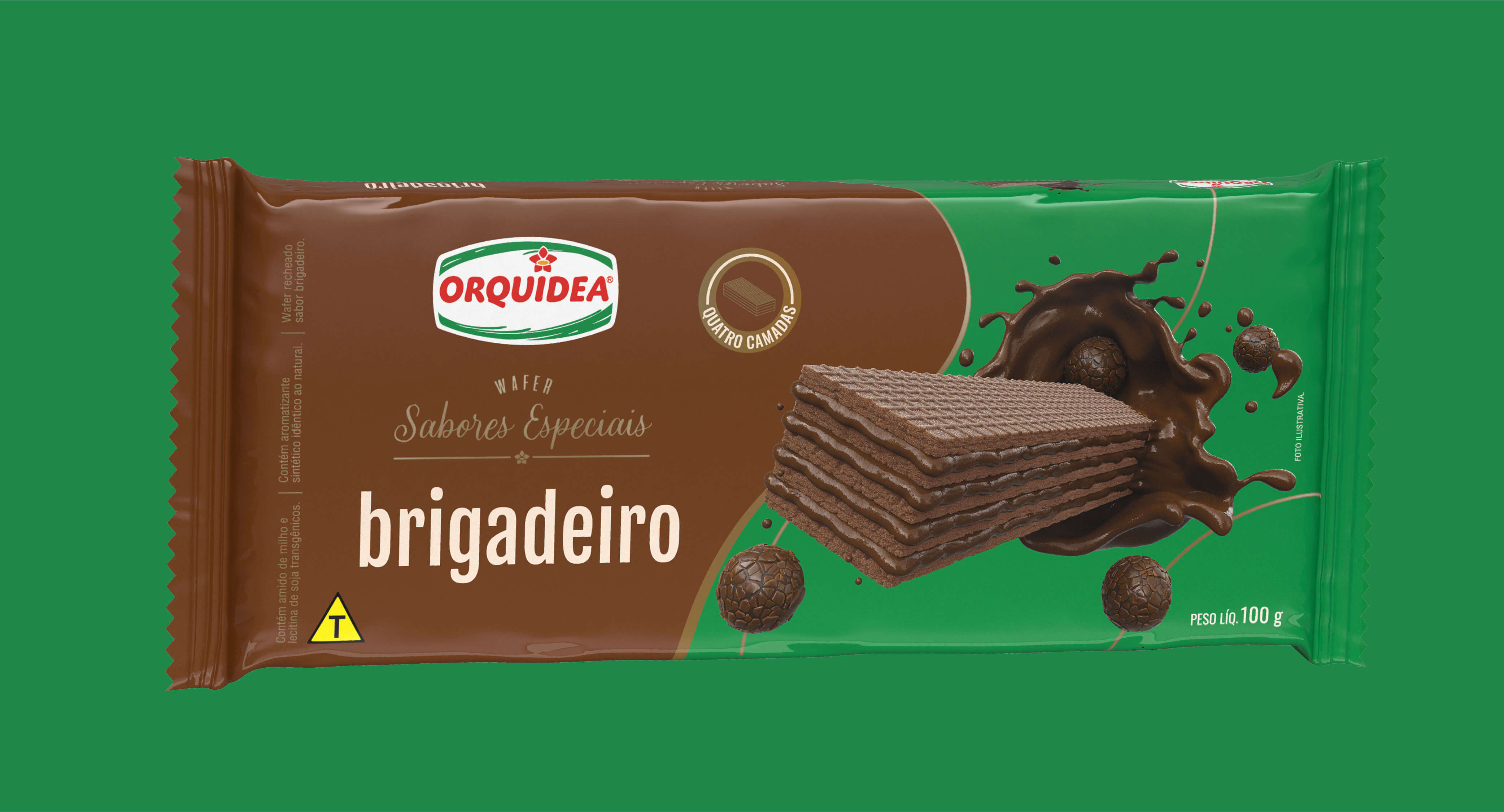
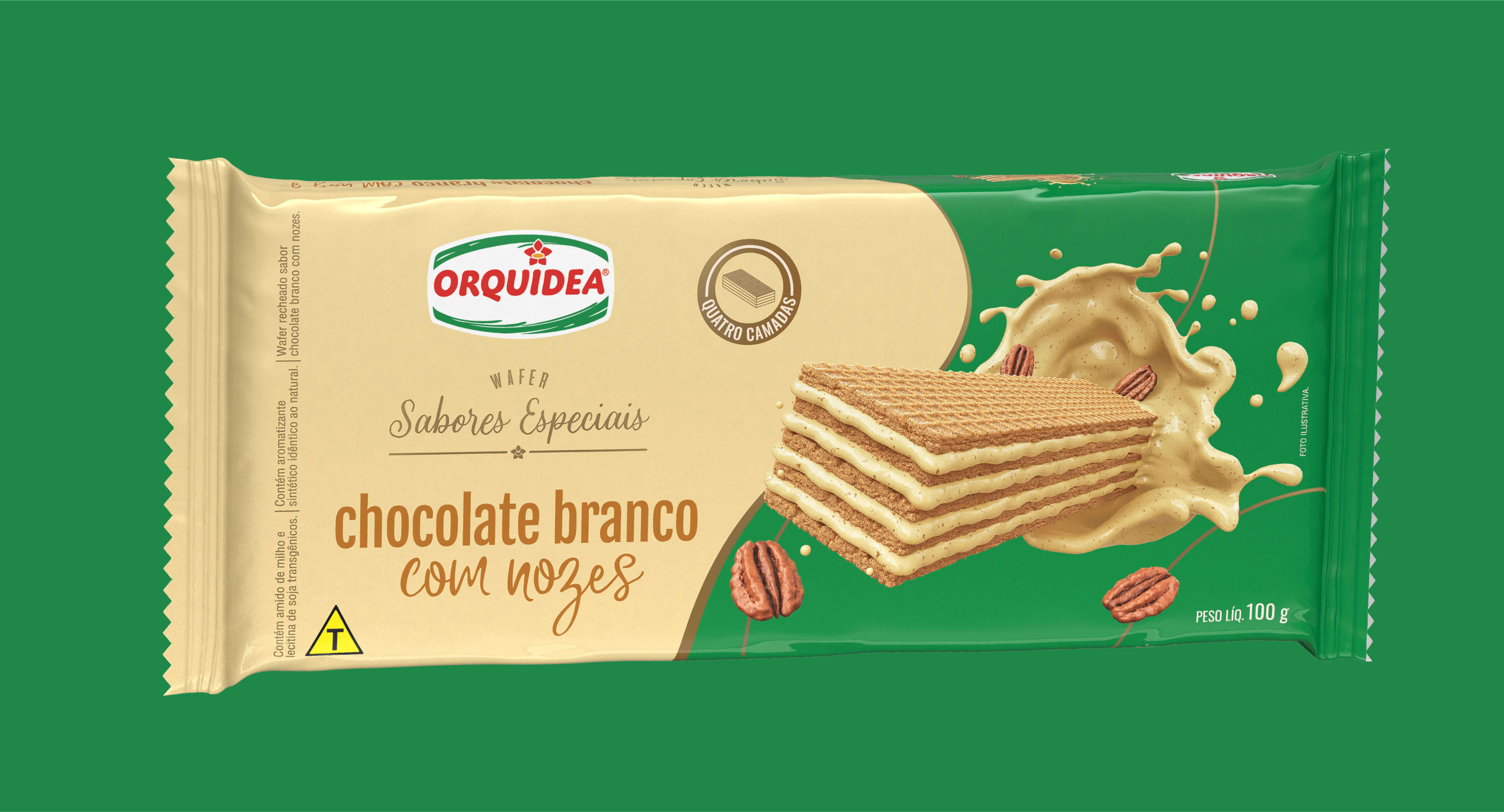
Orquídea Alimentos already had a traditional wafer line and decided to create a new line of "Special Flavors".
Our challenge was to develop new packaging that spoke to the traditional line and the brand's original identity, which had a younger look and, at the same time, sophisticated, as they were special and quality products.
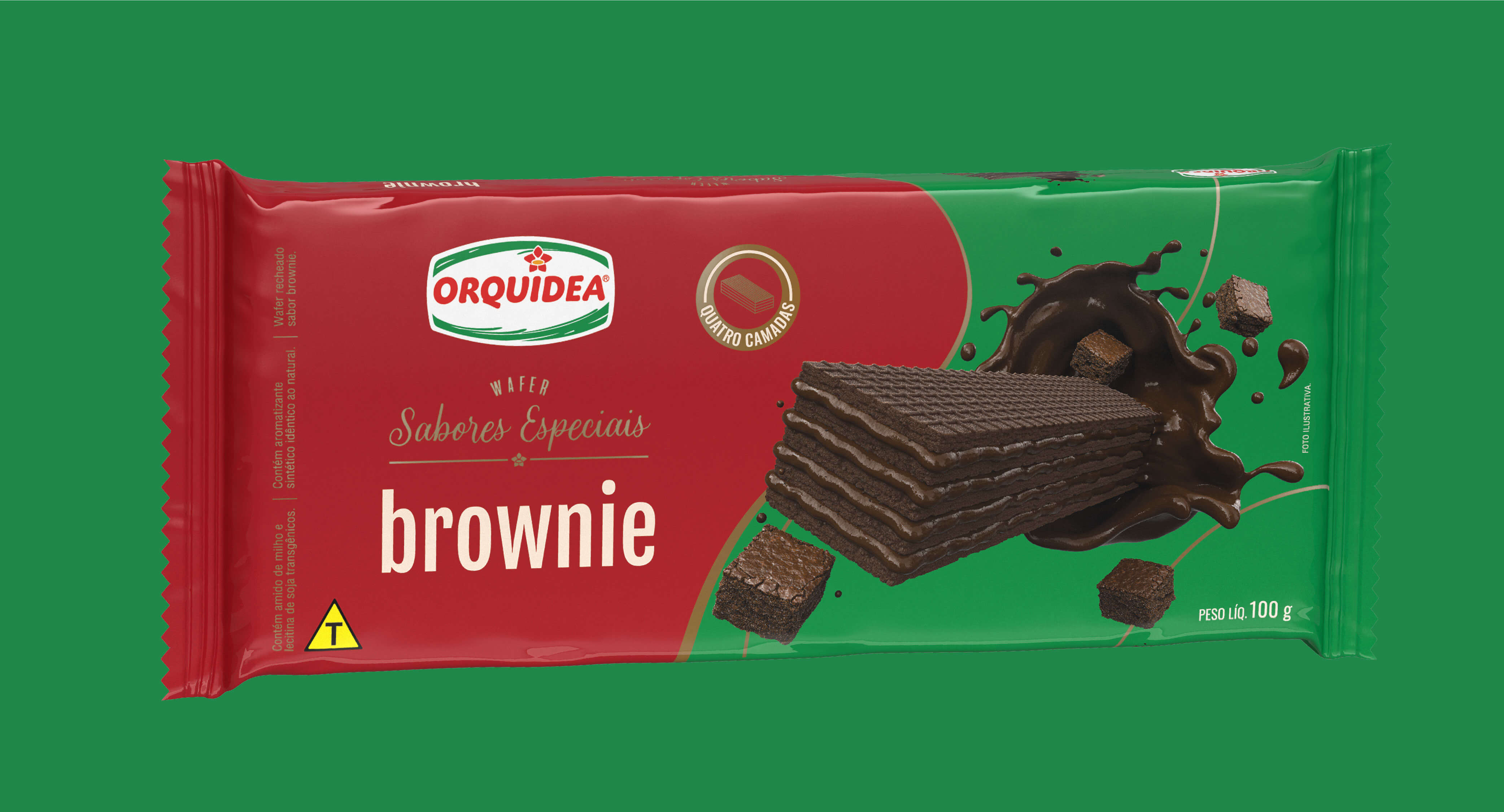
Strategy & Creation:
With all the market and competitor research, we analyze the best way to highlight the new packaging, as well as meet all customer wishes.
With that, we brought the “wave” in another format, which managed to highlight the product illustration, which was the main focus, and a "cleaner" and more "premium" layout. Always seeking to transmit the high quality of the new wafers.
In addition, the wave in green (the main color of the brand), present in the packaging of the Traditional line, was maintained in this new line to preserve unity between the brands.
Result:
The differential of a more premium category for the Wafer Special Flavors line, something requested in the briefing, was achieved through packaging that conveyed sophistication and lightness.