CLIENT: ORGÂNICOS DA SERRA
PACKING
Challenge:
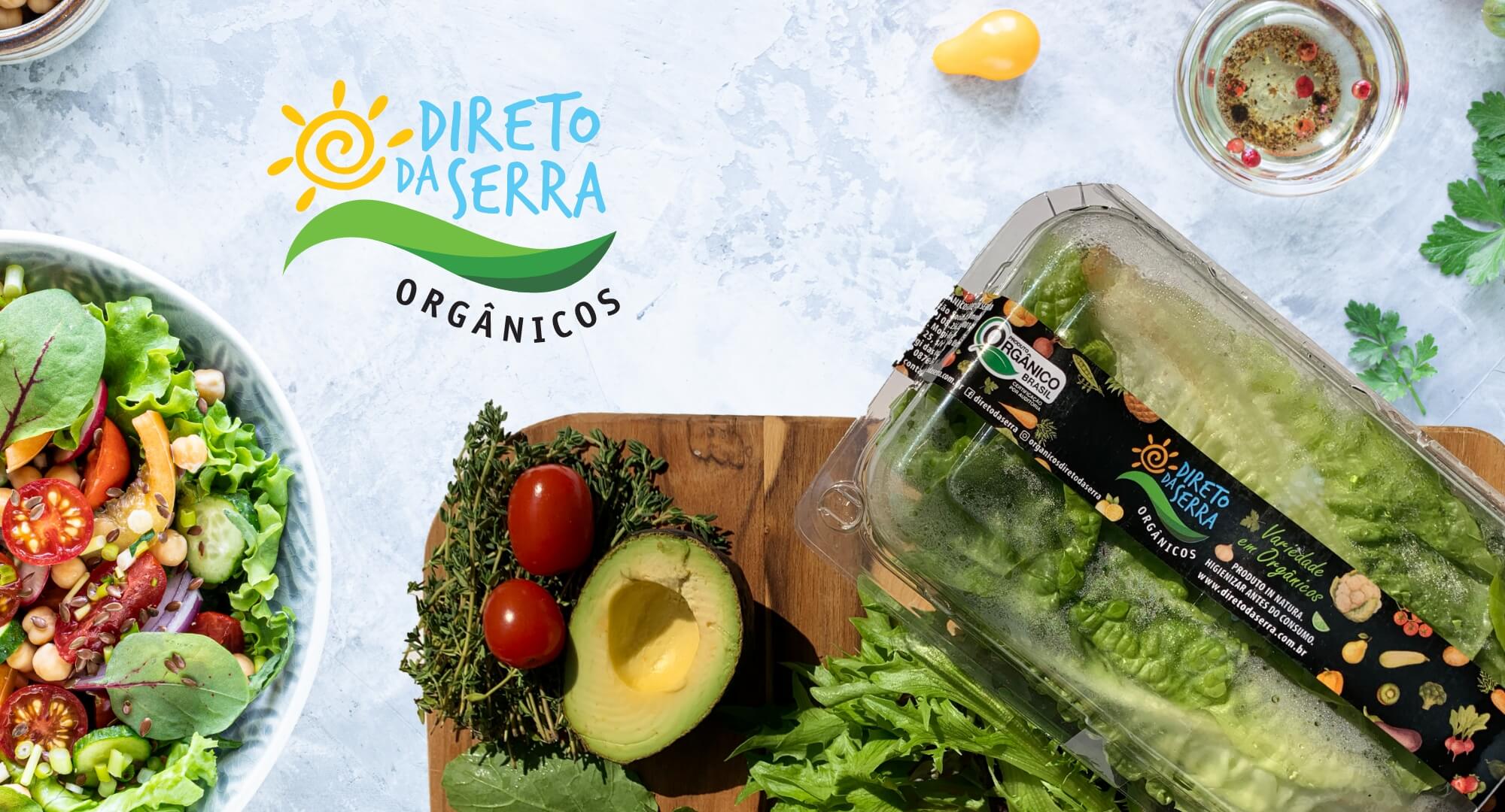
Direto da Serra is a producer and distributor of organic food with a focus on legumes, greens and vegetables.
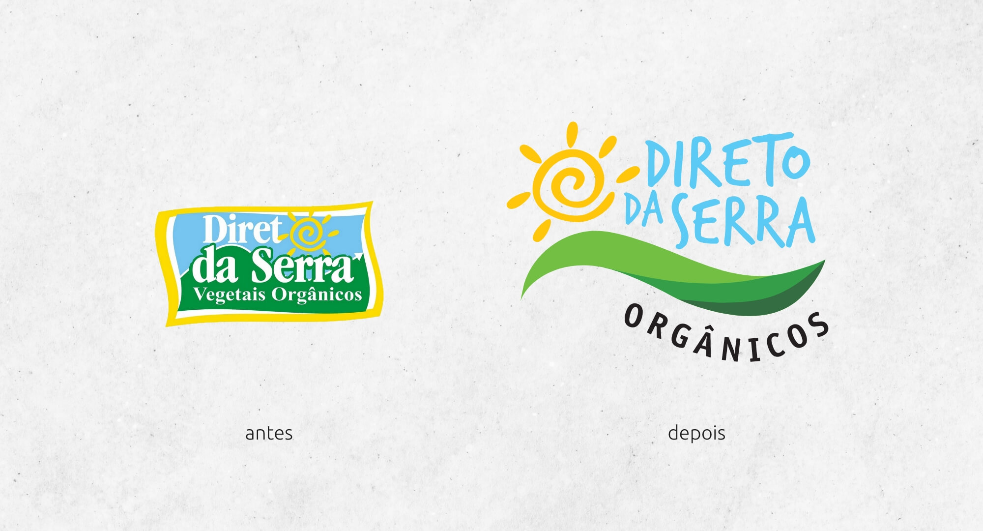
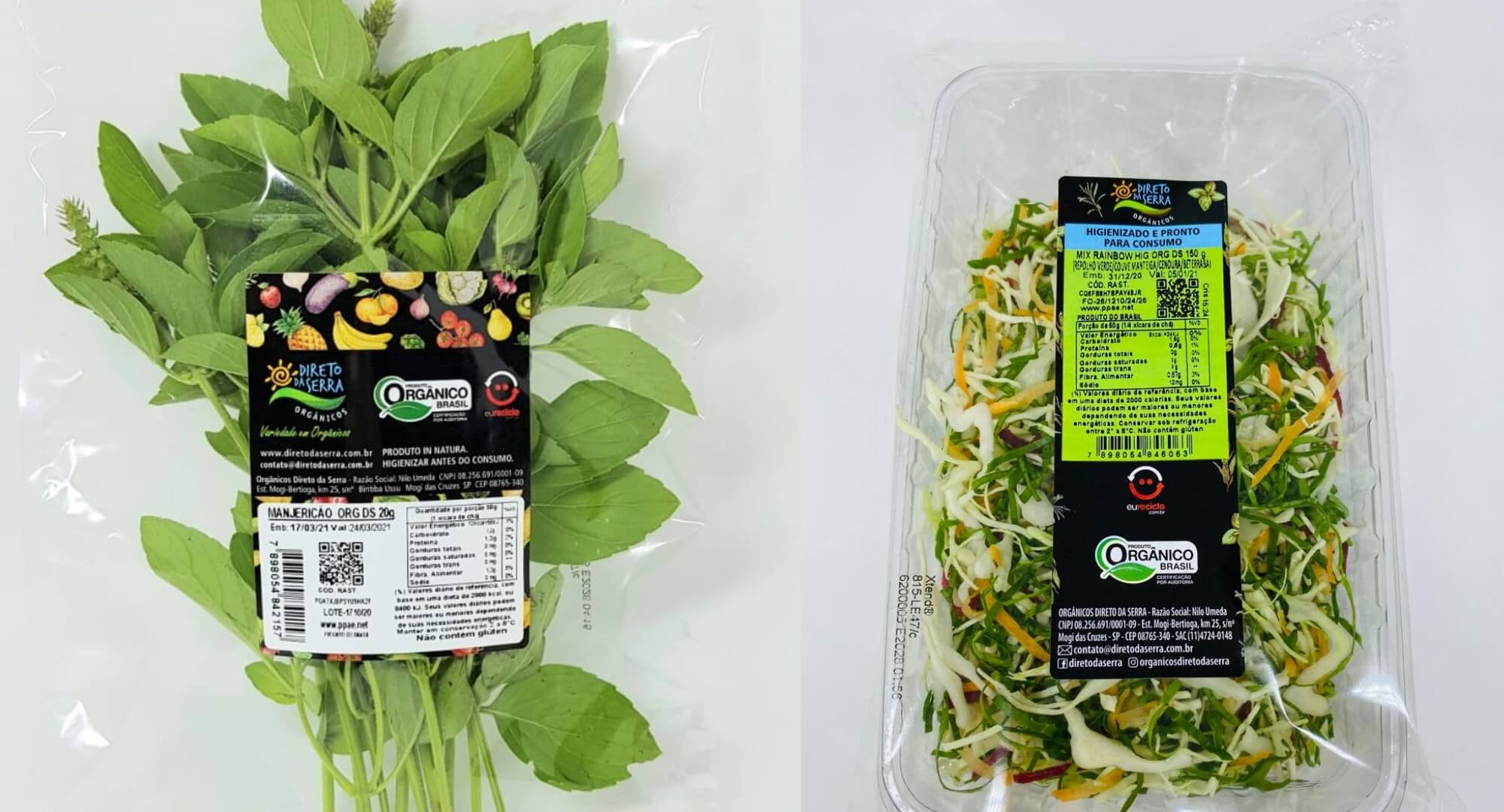
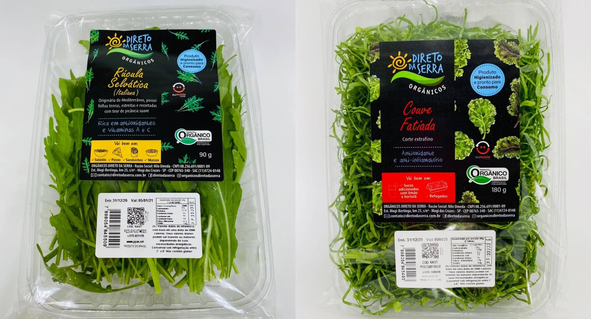
The company needed a redesign of its logo to intensify the brand's concept of lightness and sustainability. In addition, Direto da Serra needed to customize the labels of its foods, bringing the universe of the organic garden and the colorful diversity of its products.
Estratégia e Criação:
For the redesign of the logo, the basic elements of identification of the logo were maintained. The new typography ensured better readability and modernity, as well as the word organic, which was written in a curve to bring movement.
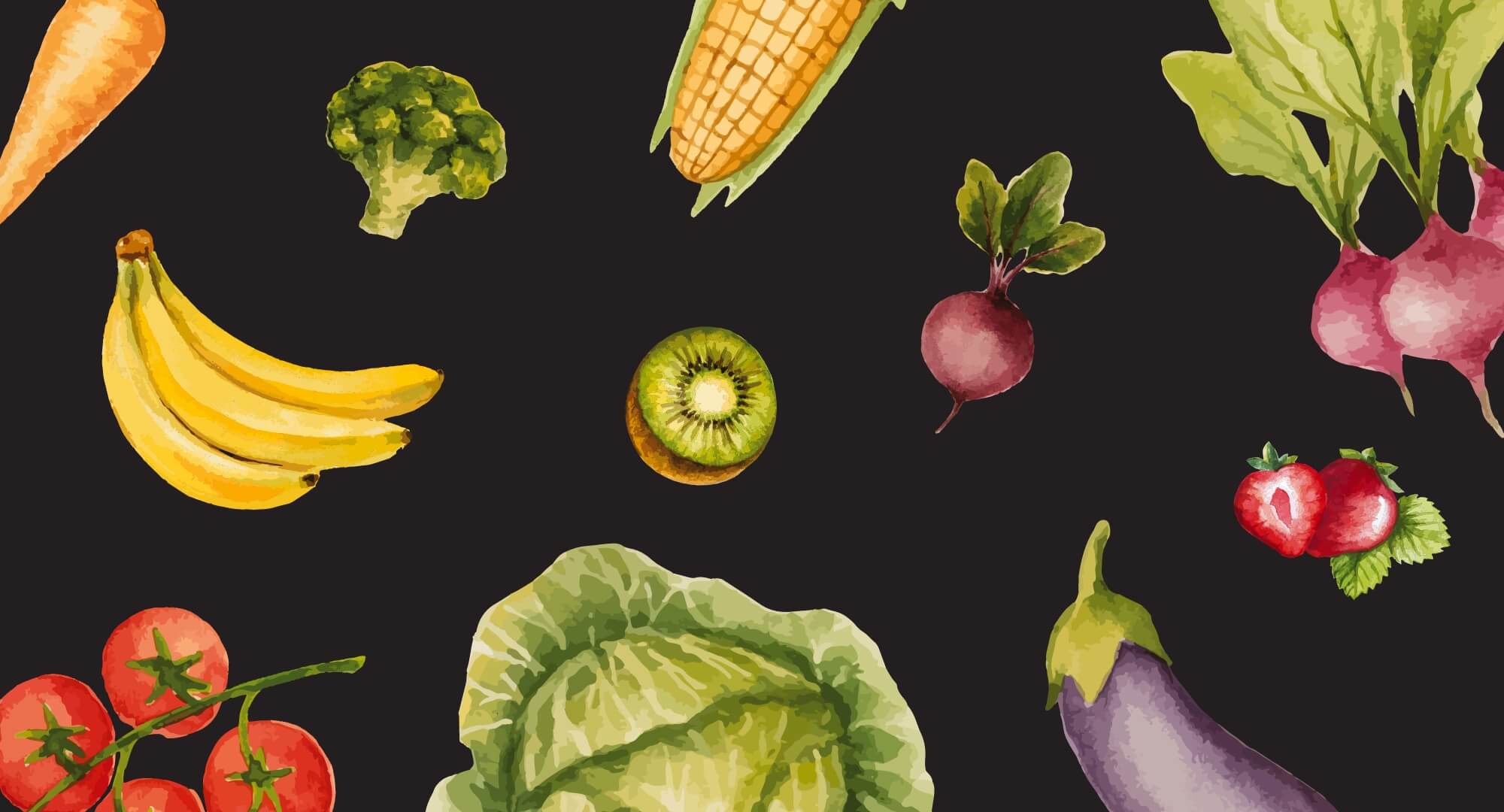
For the labels of Direto da Serra, illustrations were inserted with the watercolor language of fruits, vegetables and greens. The contrast of the colors of the illustrations with the black background brought sophistication, quality and joy to the brand.
Result:
Thus, a distinct identity was created that reflects the purpose of the brand and highlights its care for the food it produces.
