CLIENT: BrazilLAB
VISUAL IDENTITY
Challenge:
Develop the brand redesign of BrazilLAB, a non-profit innovation hub and startup accelerator in Brazil. The hub operates in the technology area, aiming to work with the federal, state or municipal governments.
Strategy & Creation:
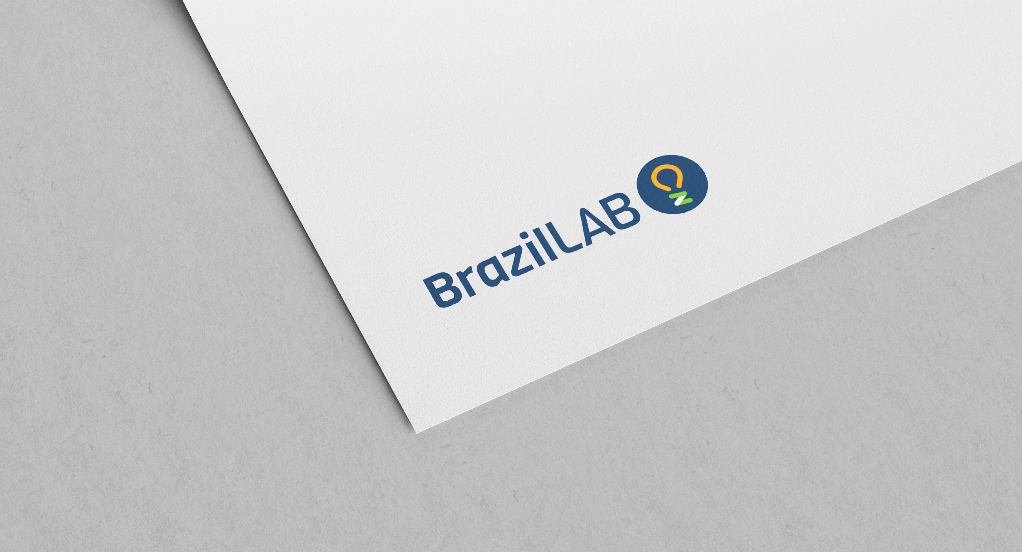
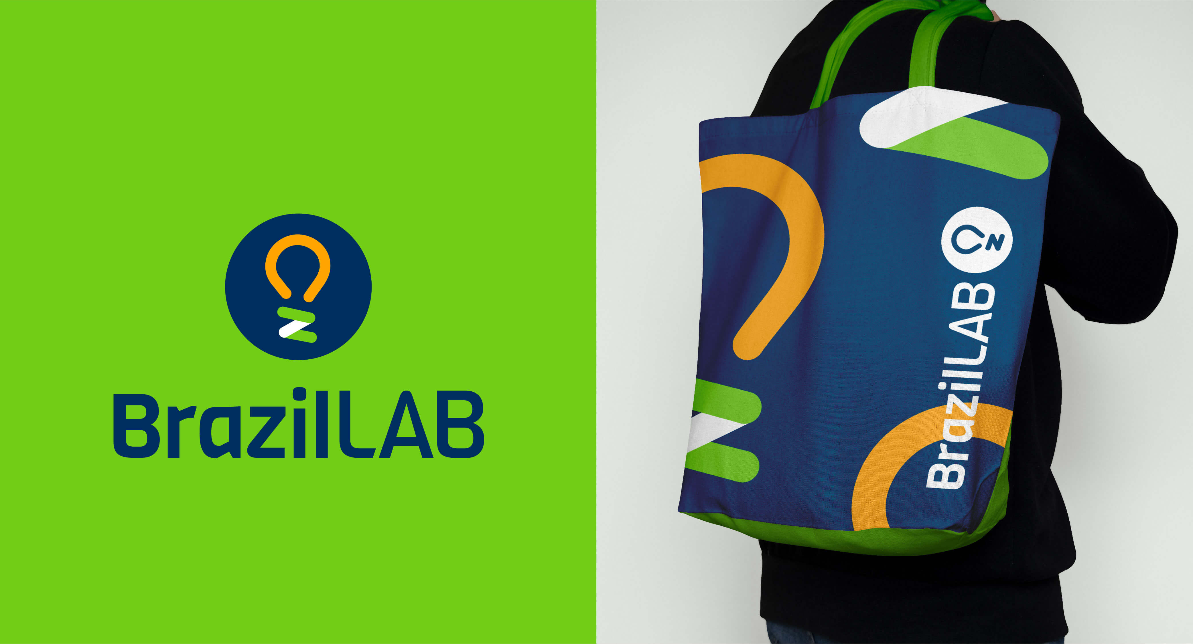
For the development of BrazilLAB's brand redesign, we created all the visual elements that symbolize the company's purpose, mainly bringing concepts of connection and movement. These concepts are present in the light bulb symbol, a strong element of the brand since its opening.
We worked with the letter “z” acting as the base of the symbol and reinforcing the brand name. The white line, which joins the two green lines and forms the letter, brings the concept of connection and, its inclination, that of movement. The “LAB” is displayed vertically and in orange to differentiate and separate the two words that make up the brand name.
The typography used reinforces, through its visual characteristics, the seriousness, the partnershipand commitment to people and partner institutions.
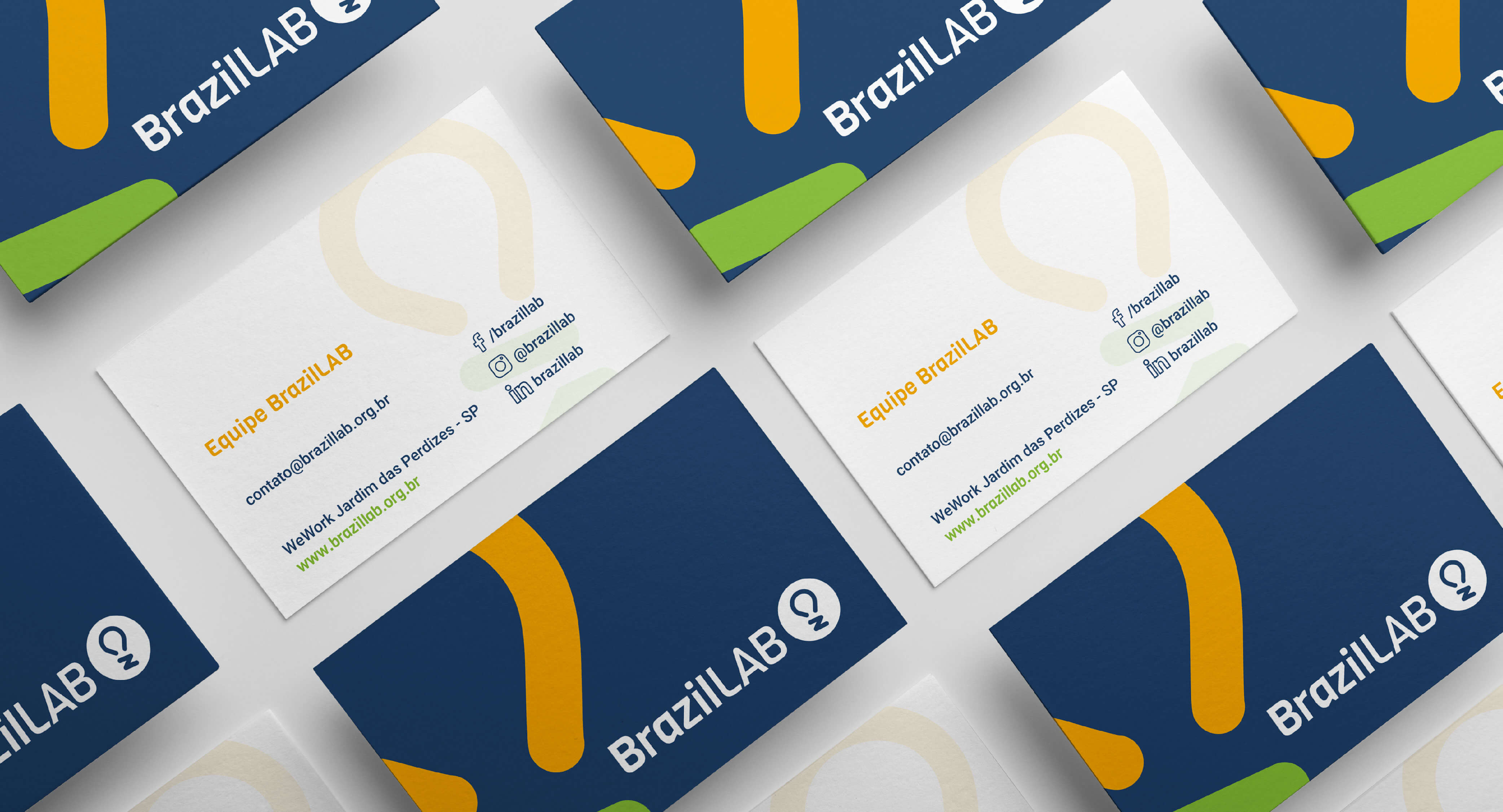
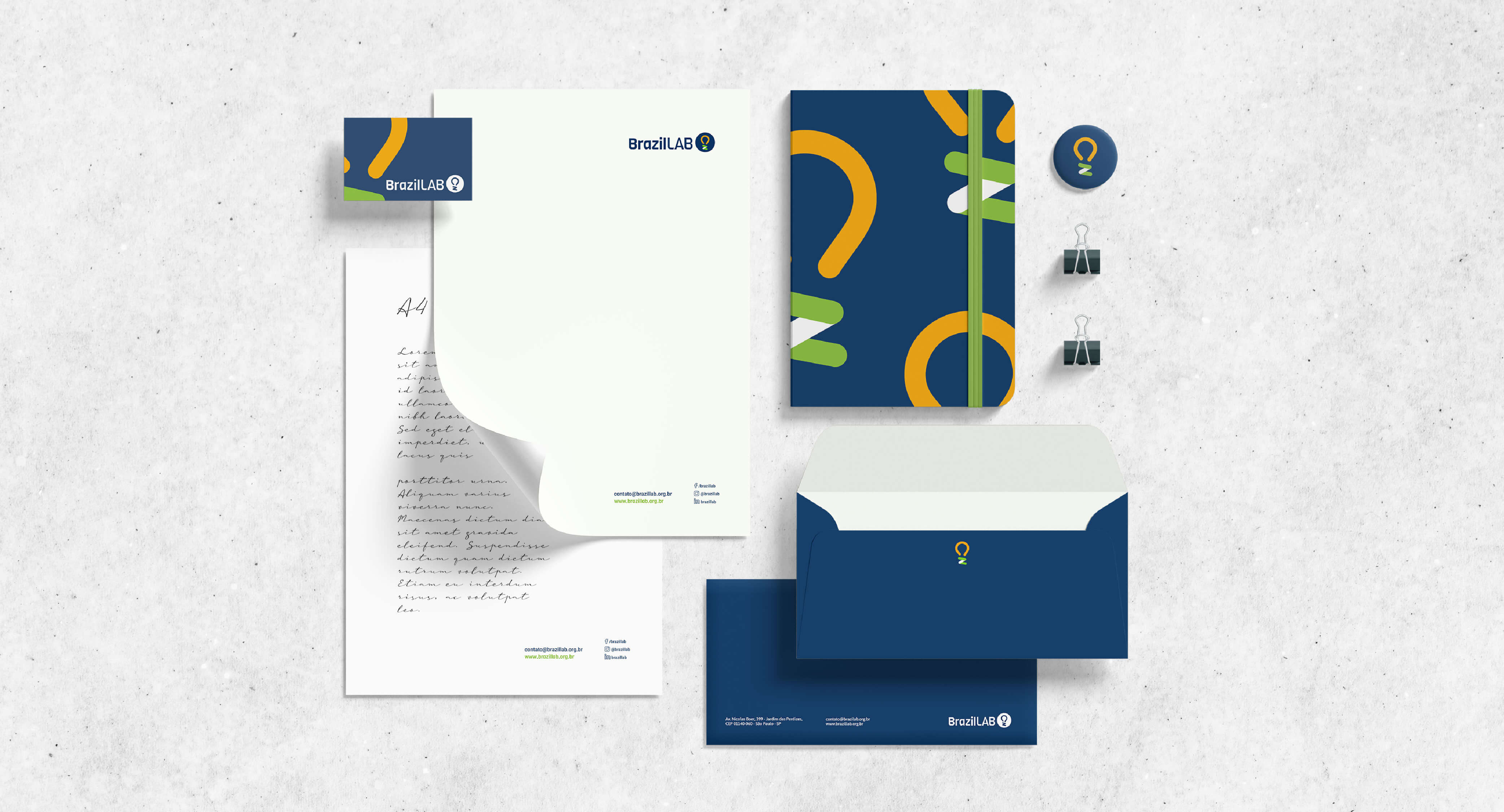
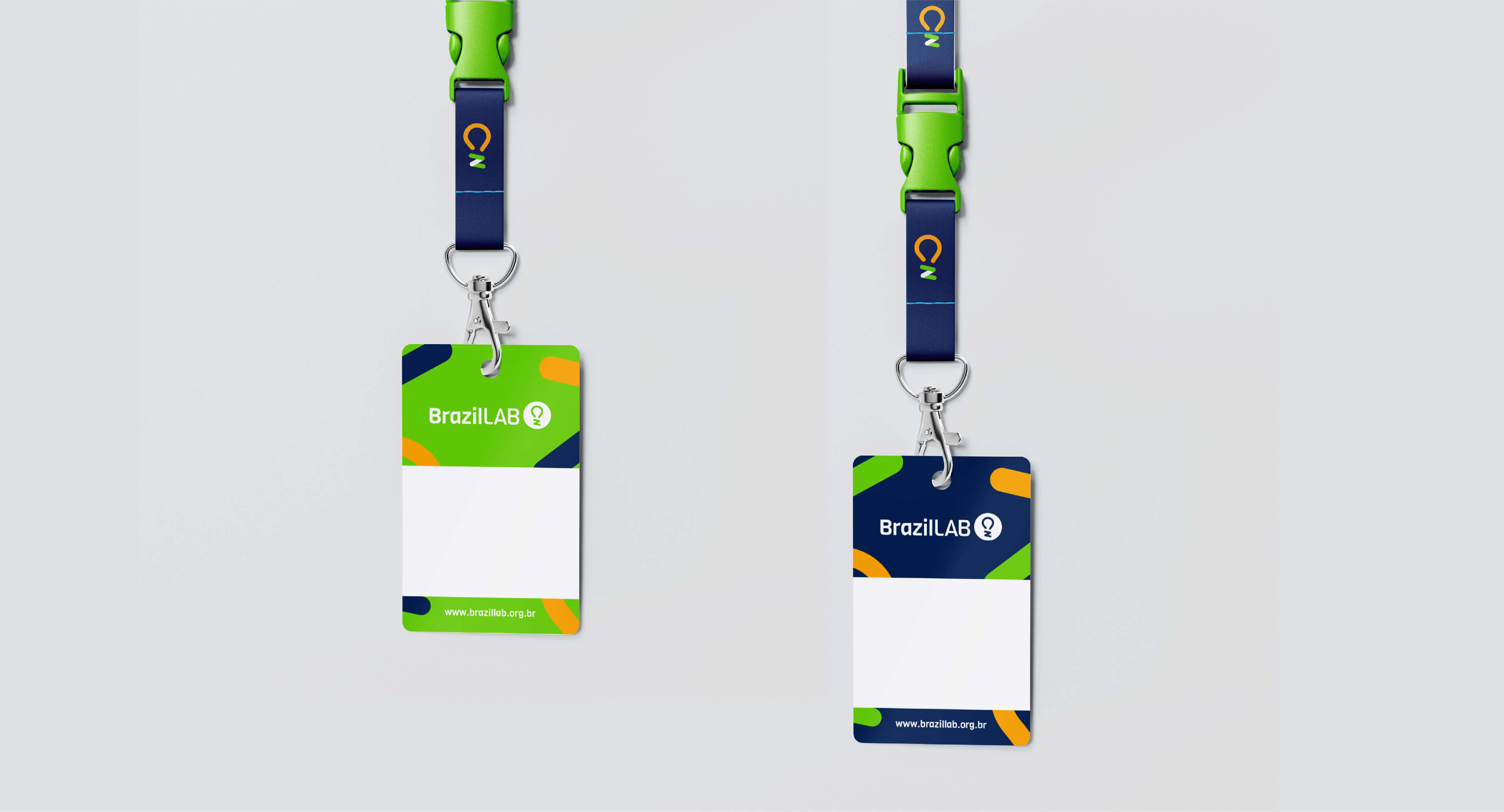
The identity created was expanded to the various points of contact that the brand has, both online and offline, such as newsletters, badges, stationery, e-mail marketing, among others.
Result:
Today, with BrazilLAB's new brand identity, the company is able to convey its essence and show the work carried out through technology in its design. The new brand highlights the purpose with specific elements, which were chosen to enhance its messages. These elements are represented in strategically defined colors, shapes and typography to develop all of the brand's online and offline communication.
