CLIENT: ÁTIMO
VISUAL IDENTITY
Challenge:
Átimo is a company for the purchase and sale of resins and the production of plastic packaging, which stands out for its expertise in the market. The project's request aimed to create an innovative identity that would show its main attributes and personality: captivating, contemporary, agile and distinctive. Therefore, we seek to develop communication that differs from others in the resins and packaging sector, following the challenge of clearly representing the brand's potential and expertise.
Strategy & Creation:
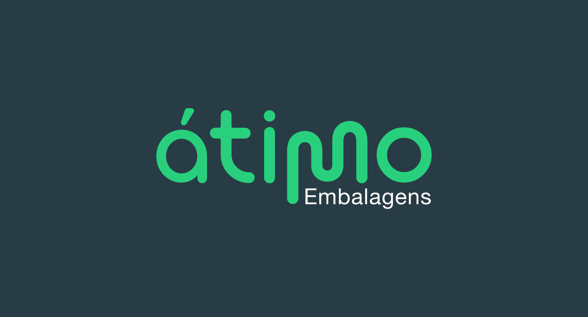
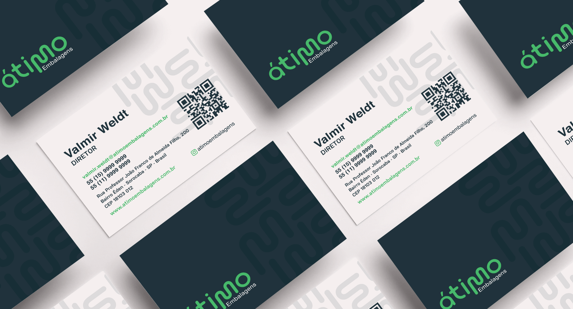
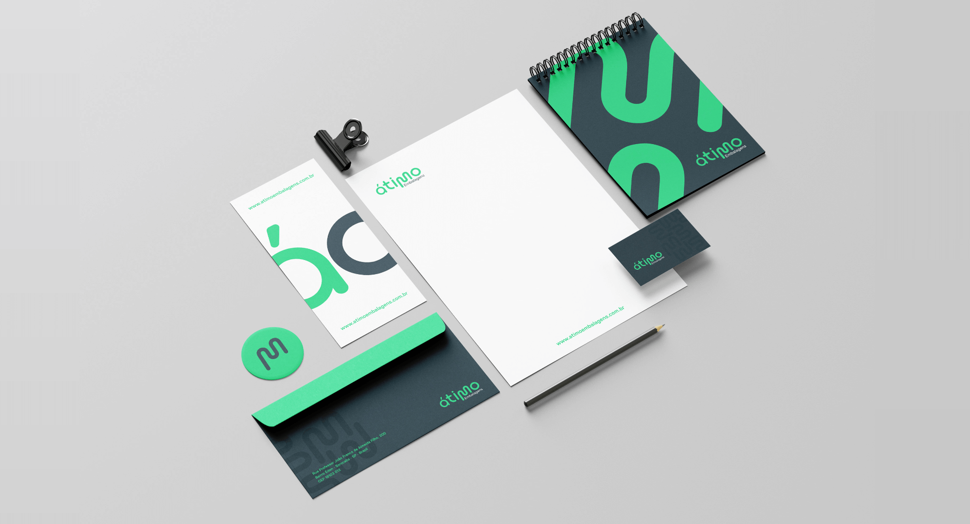
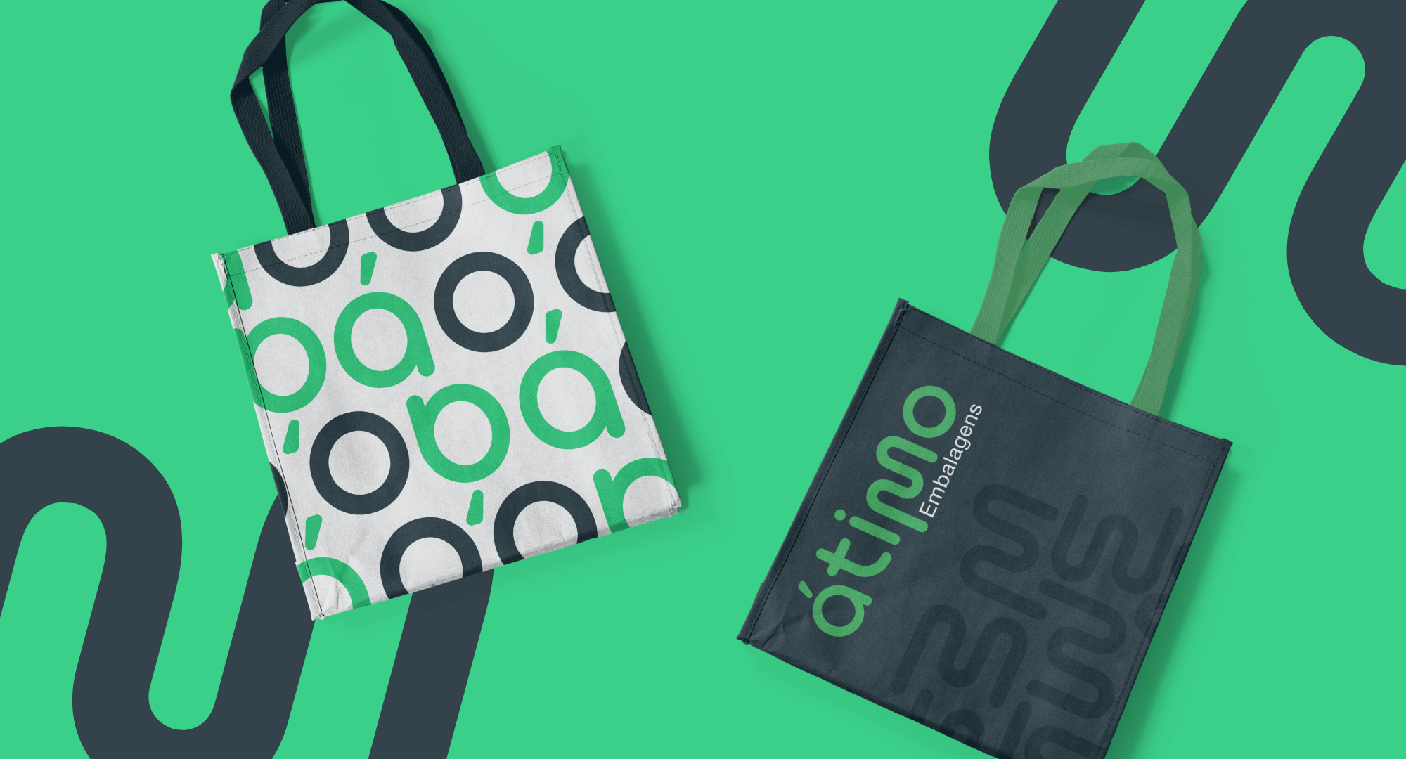
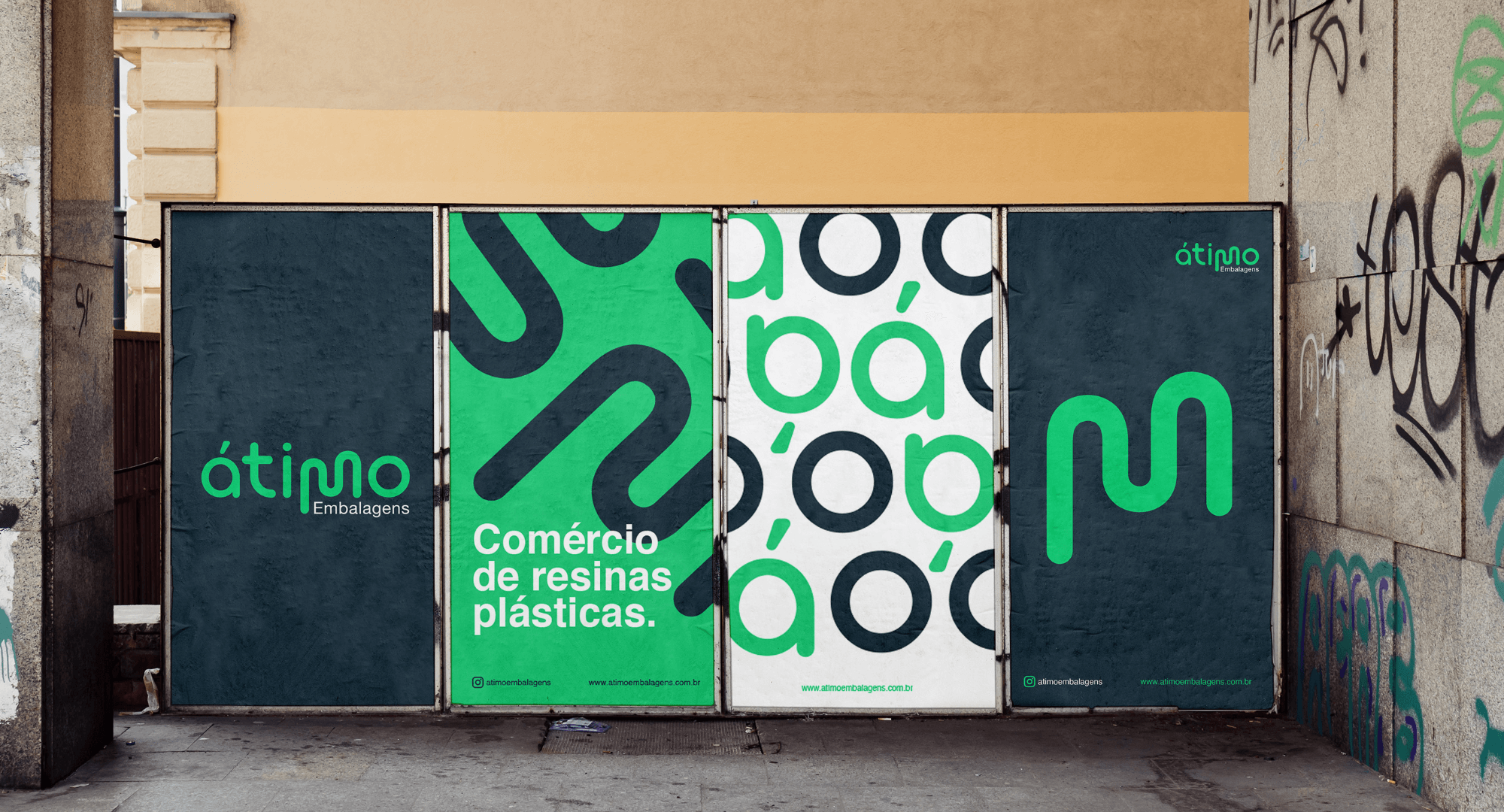
Through immersion in the universe of plastic resins, we developed a personalized typography, representing the materials made by the company Átimo. The typography is rounded and the iconic “M” refers to the elasticity and malleability of plastic at the time of its production and in the development of packaging.
Fluorescent green was chosen because its color conveys the technology employed by the company and relates to the chemical processes used to give life to the plastic. Sober blue comes as a counterpoint to represent the seriousness, professionalism and expertise of the company.
Result:
At the end of the research and development of the brand, the result reflects the client's objectives, having a striking, iconic and original identity. It is an unmistakable brand, which easily stands out from its competitors and makes identification direct by those who view its logo and all the materials created