CLIENT: AGRODAN
PACKING
Solicitação:
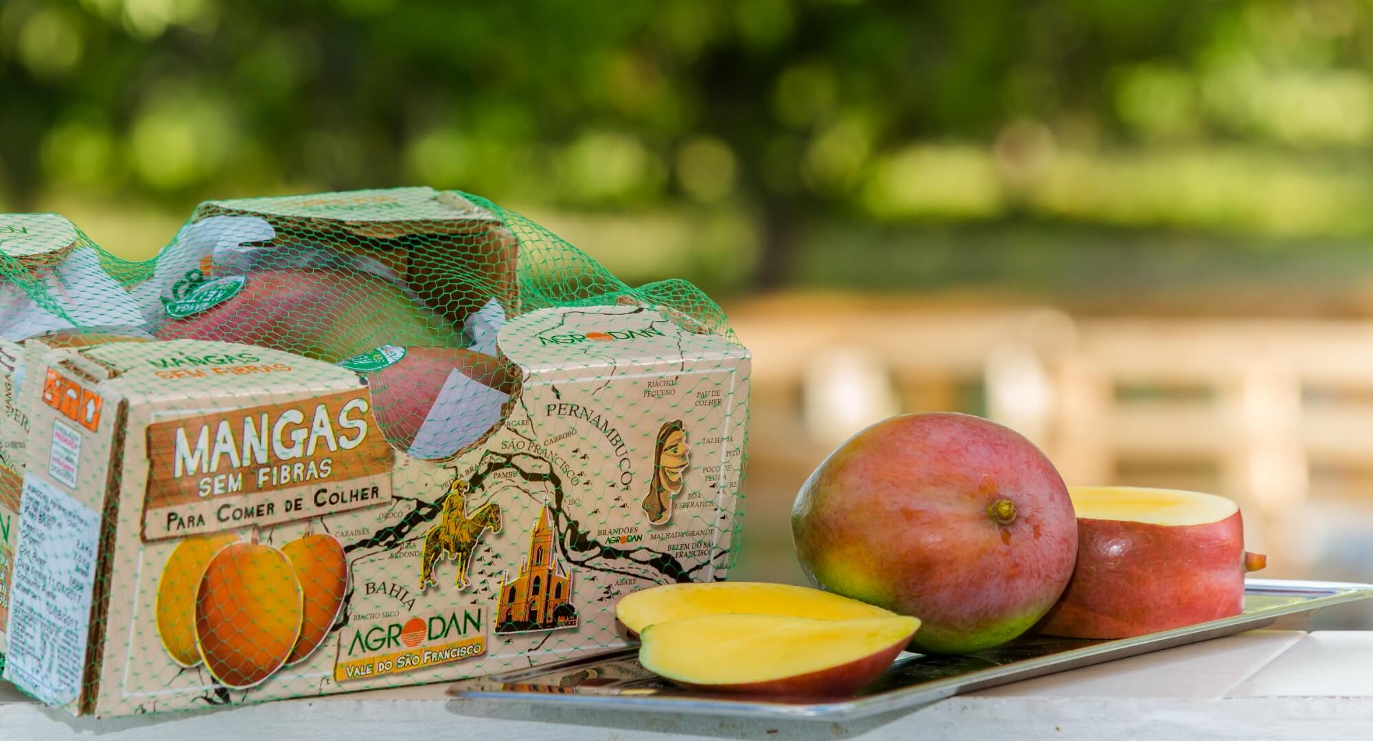
The company Agrodan is one of the largest fruit producers in the São Francisco Valley. Its specialty is the cultivation of mangoes with a high quality standard, and working with the internal and external market. To reflect the experience, technological quality and social responsibility that the company represents, it relied on BST Design to redesign its visual identity, communication materials, as well as the packaging for the different types of mangos.
Strategy & Creation:
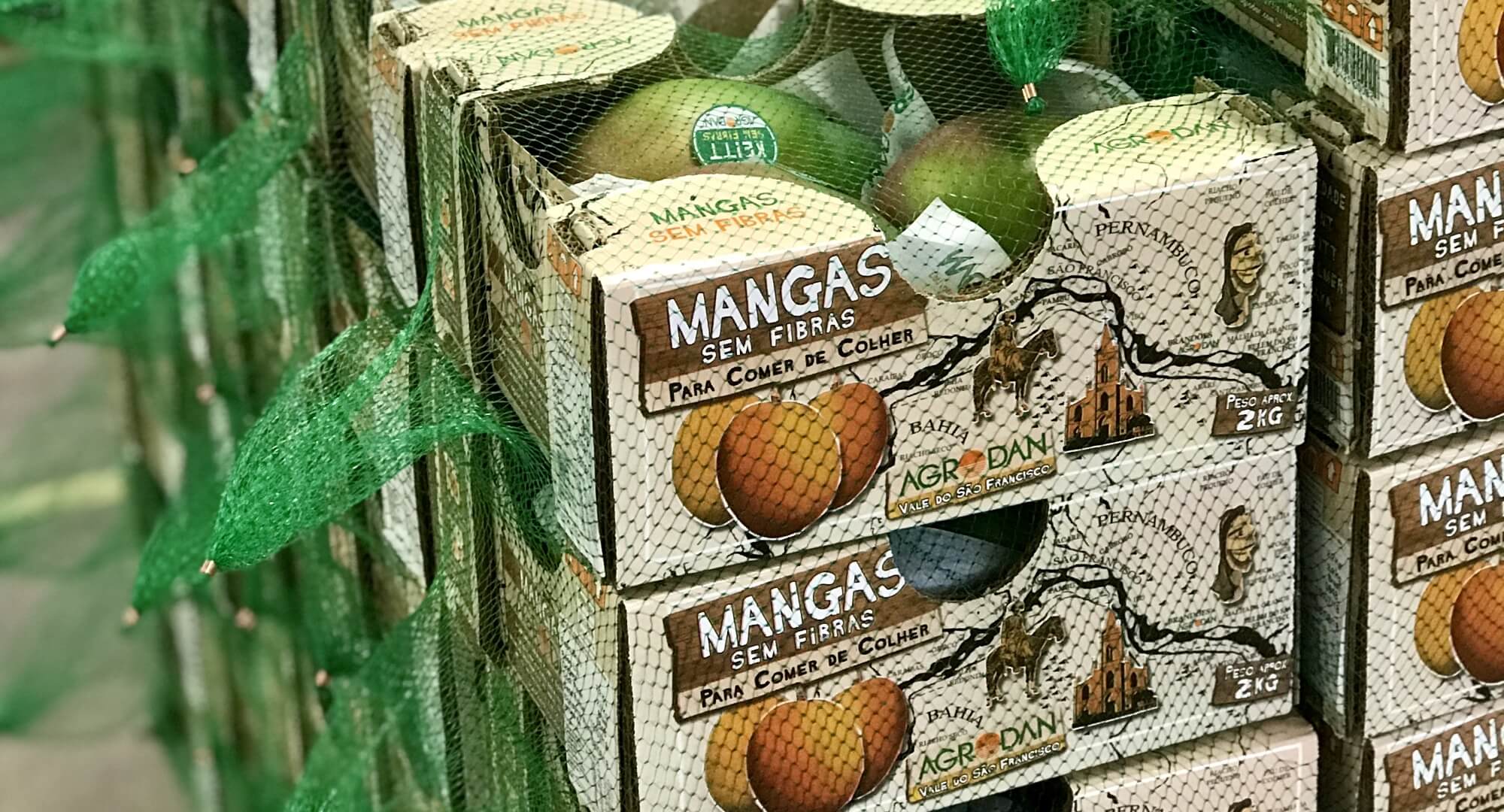
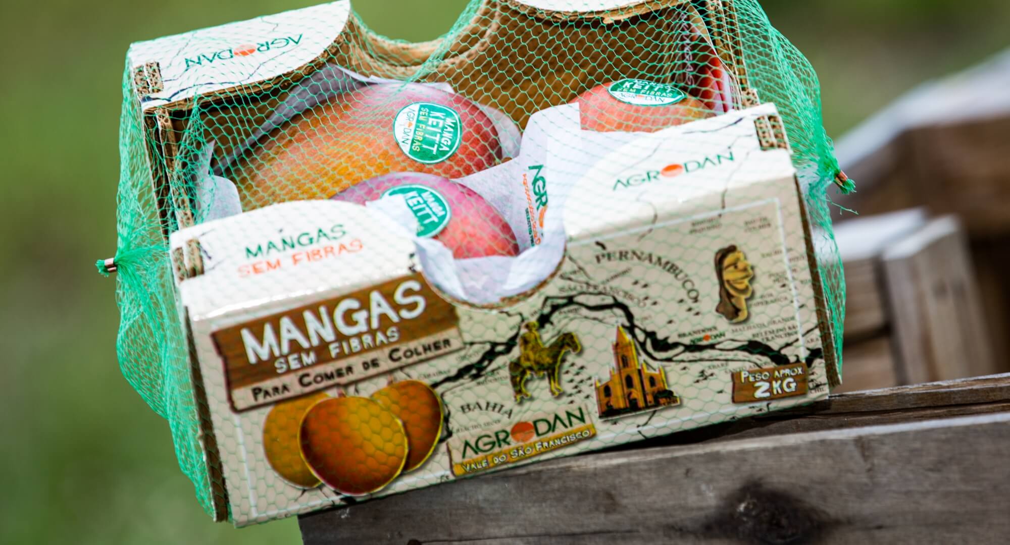
In addition to redesigning the company's logo, the San Francisco Mango Box was developed. For the creation of this box, there was a special product to be stored: Mangoes without fibers. This packaging, used in the national market, was designed in a thematic way, calling attention to the origin of the fruit: the São Francisco River Valley, a region already known by the target audience (class AA) for producing quality fruit. The packaging features a map with the course of the river. Illustrations of figures from local folklore and chosen lettering simulate the resources of woodcuts used in cordel literature, typical of the region.
Result:
The packaging made the brand stand out in the market and the quality of the projects was recognized and awarded by ABRE - Brazilian Packaging Award.